Summary: The Casio G-Shock GLX-150 and the Nixon Lodown take two different approaches to tracking time and tides. Both have advantages and disadvantages and one common feature: poor displays.
Background
Summer brings short-sleeve shirts and a chance to show off your wristwatches.
Big dive watches, fancy chronographs, custom straps and loud, colorful watches are natural choices.
And as long as it’s summer, you might as well have a tide function too!
Surfers and fishermen (fisher-people?), divers and boaters need to know the tides; perhaps residents of, say, Kansas aren’t as interested.
Surfers are more in touch with the ocean than just about anyone else, knowing its moods, its delights…and its dangers.
While many people — even those living within a bicycle ride of the beach — don’t care a whit about the tide, it’s an intimate part of a surfer’s life.
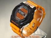
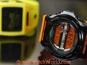
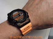
I was looking for a colorful summer watch one day when I came across the then-brand-new Casio GLX-150. What could be more noticeable than a safety orange band and one of the largest cases Casio has to offer?
The tide graph looked cool and the watch has a 20 bar water resistance rating. Scuba divers are about the only people who know what a “bar” is (not that kind of bar!), and it’s something like 678 feet. In other words, a lot.
Then I found the Nixon Lodown; the photographs made it look like it had a nice, clear, visible display with a cool-looking tide graph. I needed another watch like I needed an 11th toe, but what the heck — I ordered it.
So let’s take a closer look at each of these. No, you don’t have to live on the coast to want a tide watch. After all, even the original Endless Summer was first released in Wichita, Kansas in the middle of winter to sellout crowds. Obviously, there’s ocean interest no matter where you live!
The Casio G-Shock GLX-150
There’s a huge G-Shock community out there and many collectors own dozens of them. Casio is known for creating limited editions, partnering with fashionistas and generally doing all sorts of things to keep up the demand for what is basically the same watch in a different case with different colors. OK, maybe two or three basic watches, but to most people, a G-Shock is a G-Shock.
I’m a sort of closet G-Shock fan; I like the concept, and I’ve owned maybe a half-dozen over the years, including the original when it first came out (wish I still had it!). But I have never found the “perfect” G-Shock. That hasn’t stopped me from a continued search though…
My GW-9100 “Gulfman” with the part-titanium case and “atomic” time synchronization is my favorite, although I rarely wear it and keep it pointed at the window for its nightly time check duties. I use it to set all my other watches whenever I pull one out of the box for the day’s wear. (See the webWatchWorld “Three Casio G-Shocks and a Waveceptor” review)
The GW-9100 was listed in the Casio catalog for many years, until it disappeared recently — I’m not sure why. It has the clearest (i.e., easiest to read) display of any G-Shock I have ever owned…which can’t be said for many G-Shocks, unfortunately. That’s my biggest beef (one of them, anyway) with G-Shock watches. The displays are generally awful.
You’d think Casio would have this wired by now; after all, they’ve been making the things for…how long? And they make all sorts of other electronic gizmos, cameras and the like. They should be leaders in the field of “micro” LCD displays. Instead, their current trend seems to focus (pun) on negative displays, like the GLX-150 shown here. And Casio negative displays are among the absolute worst I have ever encountered.
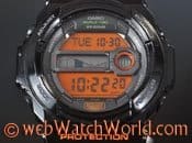
When you have to study the watch, turning it this way and that with indoor lighting to read the time, something’s not right. The GLX-150 has an orange background with silver (it looks dark gray) numbers. Basically, the numbers are transparent and reflect the silver background underneath. Get it indoors and it’s very difficult to read in many standard lighting conditions. It’s better outside, when the sun is shining and there’s lots of contrast.
I suppose it could be argued that a surfer, fisherman, etc. will have no trouble reading it outdoors. But surfers and fishermen rise pretty early and want to check the time and tide too. The backlight in the GLX-150 helps; it’s definitely bright. But the watch would be so much better with dark black numbers against the light orange background.
And don’t trust those Casio (or Nixon) photos. They must be Photoshopped — that’s my only explanation, because there’s no way the watches are as readable in “real life” as they are in the stock photos, in which the contrast and brightness have apparently been adjusted to make them look much better than they really are.
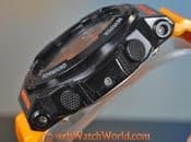
Which brings me to my second biggest complaint about all G-Shock watches: the buttons. Again, Casio has been doing this for years, and they still don’t have it right. The button pushes it takes to get anything done are simply not intuitive and it takes a careful study of any G-Shock owner’s manual to figure it all out. The problem is, when you decide you need that second timer or stopwatch, you’ll be fumbling with the thing for a half-hour before you figure it out…unless you carry a copy of the owner’s manual with you!
In comparison, my Tissot T-Touch Expert (review coming one of these days) has as many functions and more. It has three buttons, only two of which are used for most of the features. It’s very intuitive — so much so that after the first read of the owner’s guide (which is, by the way, about 15% the size of a typical G-Shock manual) I had it completely wired. I have never had to refer to the owner’s manual again.
Granted, it has a touch screen…but that’s something Casio should have pioneered a long time ago. Bottom line is that I dread whenever I have to change the time or switch GMT on a Casio watch. Not so with the Tissot.
Casio GLX-150 Details
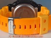
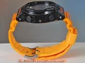
The GLX-150 is a big watch, with a 51 mm wide case that runs 53 mm from lengthwise. It measures 16 mm thick. While it wears pretty big, I can still fit it on my ~7.125″ wrist. It’s probably a bit big and the top and bottom edges hang over my wrist slightly, but for summer short-sleeve shirt wear, it works. The glossy orange strap can be tightened enough to keep the watch from flopping around, which helps.
The keeper is a strange off shade of peach though, which bothers me because it doesn’t quite work with the orange strap color. It matches the inside of the strap though, which is the same peachy color.
The huge case encloses a fairly tiny display. If you measured the amount of surface area of the display (I didn’t) and compared it to the size of the watch…well, it’s way out of proportion. Seems like Casio took a basic display from a smaller watch and threw it in a big case, instead of designing a nice, big display for a nice, big watch.
The vinyl integrated strap is a wide 29 mm at the lugs and narrows to 22 mm at the ends. There’s 125 mm of strap on the “holy” end and 77 mm on the buckle end; not really enough for strapping over a wetsuit.
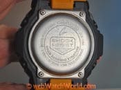
The watch is well built and feels solid and it’s fairly light at 71 grams with the strap. There are some ridges along the edges of the underside of the strap, and these help to circulate air; in fact, I’m surprised that I don’t get the typical Casio G-Shock vinyl strap sweaty wrist when wearing the GLX-150.
The functions are standard Casio, with multiple timers, GMT, countdown and more. Does anyone ever use those features? I’ll get to the tide function in a minute when I compare it to the Lodown.
The face of the GLX-150 has a sort of “3D” effect, with raised surfaces. This is interesting and it seems like something Casio is pushing lately on several other new G-Shocks.
What’s also interesting is apparently the GLX-150 was a limited edition. You never know with Casio, and this one appeared at the beginning of the summer of 2012 and is now gone from its U.S. online catalog.
Nixon Lodown Tide Watch
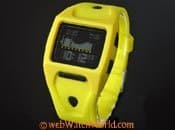
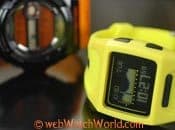
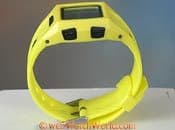
Nixon has a large selection of tide watches and the Lodown is the latest in a line of similar-looking square tide watches. The Lodown is available in a wide variety of colors, some with contrasting buttons. The bright yellow suited my desire-of-the-moment for a flashy style watch and the photos of the tide graph display on the Nixon website sealed the deal.
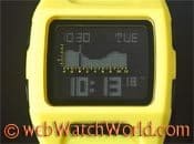
Unfortunately, the display on this watch is even worse than the Casio. It’s barely readable in anything other than bright light. That’s too bad, because the format of the display is actually pretty cool and better, I think, than the G-Shock.
The other big problem with the Nixon Lodown is the instruction set — a big fold-out that reminds me of those pre-GPS printed road maps that, once opened, could never be folded the same way again. The “instructions” — if you can call them that — are nearly inscrutable, so changing any setting on this watch can be a real challenge.
For example, one of the things they don’t tell you is that there is a pause after a button is pressed, then the display indicates which mode is being selected. I must have spent a half-hour pressing buttons with nothing happening, until I realized a little patience would load the next mode screen.
All of these issues with the displays and buttons on both of these watches really make me wonder how they have become so popular. Perhaps if sales dropped, both companies would have to re-think the designs — and it shouldn’t be very difficult to make it better. My guess is that very few owners actually use any of the hidden features — how could they? — and that the manufacturers list them only like camera manufacturers do with pixel count: more is better, at least for marketing purposes.
Nixon Lodown Details
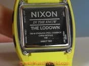
The Lodown (that’s the way they spell it) is smaller than the Casio GLX-150. It measures 41 mm across (but wears larger) and about 45 mm lengthwise and it’s 14 mm thick. The semi-soft flexible strap is blended and integrated nearly seamlessly into the watch case and I think it would be very difficult to swap out this strap for anything else. Good thing it’s comfortable…
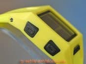
The integrated strap helps make the watch seem a bit larger than it really is. I like the bold, nearly high-viz yellow color and the contrasting black buttons and fixtures. Even the black display is a nice contrast…if only it was easier to read the time and tide.
The strap measures 33 mm at the “lugs” and 25 mm wide at the tip; another reason why this watch wears larger than it is. The wide strap and semi-soft plastic distributes the light 56 gram weight very nicely, so it’s a comfortable watch and it doesn’t make me sweat, even in hot weather.
The Lodown is rated at 100 meter water resistance, but like the Casio, you better not touch the buttons whilst in the water. This makes no sense at all for a surf watch, especially since there’s a wave count and heat timer buried in there as one of the functions. How can you count the waves and change the timer if you can’t touch the buttons when you’re out in the water?
I’ve read reports from Lodown owners complaining that the water resistance isn’t very good, but I haven’t experienced that, probably because I’m fanatic about not going anywhere near the buttons in the water.
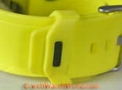
One nice feature is the little “nub” on the strap; it fits into a hole in the keeper, and this really does help to ensure that the strap will stay put, especially when you’re punching through those big barrels.
Setting the Tide: Casio vs. Nixon
I won’t describe all of the features and button pushes on these watches, because Casio owners will feel comfortable and the Nixon is too complicated to describe. For me anyway…
But let’s take a look at how to set the tide function, because the tide graph is the main reason I chose these watches to begin with. This is where both watches vary in a quite interesting manner.
The Nixon has a built-in database of 200 beaches around the world. As long as your beach is one of them, you’re golden. But how many beaches are there really, versus the 200 that are in the database? So chances are you can get close, but not exact.
The built-in database means that the Lodown is actually easiest to set a tide. After studying the directions for some time, I figured it out. Press and hold the “Mode” button (button on lower left at the traditional 7 o’clock position) until you see the “Hold to Set” text appear. Then you can press the black “Nixon” bar along the bottom of the display to set the time, the 12/24 hour format and, eventually, to choose your local beach.
The Casio takes a different approach that’s a little more complicated but customizable. To set your home beach, first calculate your UTC time offset. Then all you have to do is select your “lunitidal interval” from a list in the owner’s manual. The lunitidal interval “is the time elapsing between the Moon’s transit over a meridian and the next high tide at that meridian”. Huh?
Here’s the U.S. Naval Observatory moon phase calculator. And you’ll also need to know the longitude of the selected beach.
With a little bit of playing around and some Bing search engine work (links above), I figured out the tide for the
Fire Island inlet. . Except, I had to fudge the interval quite a bit until I got it to synchronize with the actual tide shown in the marine charts. It works and I’m happy to say that both of these watches have kept accurate tide information, checked with various online tide reporting sources, for about 4 months straight.
Lume (Backlighting)
Both of these watches have internal lights. On the Casio, press the upper right button for a nice, bright light. Too bad the display didn’t have that much contrast without the light! On the Nixon, press the button at the upper left. The effect is subdued and sort of turns the pixels a cyan color, but it works.
Movements and Accuracy
Both watches obviously have quartz movements. The Casio is surprisingly accurate, holding within 2-3 seconds out to about 3 months. The Nixon isn’t as accurate, running nearly 1.5 minutes slow over the same time period.
Conclusion
You probably think I’m being rather harsh on both of these watches. In fact, I like them both and although I initially took a dislike to the Nixon Lodown, its combination of comfort, bright colors, contrasting buttons and the way that it shows the time and tide has won me over. If only the light-colored pixels on that display were brighter, or as bright as they show in the Nixon online photos, it would be a winner.
The Casio frustrates me like Casio G-Shocks usually do. I’ve owned several and I’ve never really got on with their system — it just seems way more complicated than it should be, and with four buttons, it ought to be simple, straightforward and logical to change the settings. It isn’t.
Now that summer is over, I sort of scratch my head, wondering why I bought either of these, when the same amount of money could have bought an analog dive watch. Of course, that wouldn’t have indicated the tide…but it’s so easy nowadays to look up the tide on the internet. I’ll probably sell both of these, and then knowing me as I do, next summer I’ll be looking for another. And so it goes…

